
I heard it from Paloma.
Who heard it from ShelterPop.
Who, it appears, was right on the money.
Which is just really exciting. No more searching ebay for back issues :)


 The girls worked really hard. They kept asking how many pies worth of cherries we had.
 First we picked the two pies' worth that Grandma asked for. The children proudly took them to the house and delivered them to her when we were done.
 Then, they started keeping track of our own pie count. I'm telling you, they were really excited about those cherries.
 Even though they're sour and the pies really need sugar added, the cherries have a shocking tartness that makes it fun to eat them straight off the tree, too. Kind of like sour patch kids candy only about 400 times better. Grandma didn't spray the tree with insecticides at all, and we had just had several days of hard rain, so these little gems were squeaky clean. Yum.
 Punkin and Little Dude started to get a little tired after a while. I couldn't really blame them; it wasn't as interesting for them once the cherries were all picked from the branches they could reach. Punkin is 5 and 1/2 and Little Dude is 3 - neither of them had ladder approval. So, they just hung around, played, and helped dump the little containers into the large bucket from time to time.


 They did both miss their rest times, though. Punkin doesn't need a rest as much as Little Dude does, but they were both showing signs of breaking down by dinner time.
 We kissed and hugged Grandma a good dozen times each, packed up our cherries and children, and headed home.


So, where does a girl go when she's in the market for wall hooks?
She could certainly go to Target. Here's a very nice option for $7.99. It's a good looking hook.
Or she could spend a little more and, for $20 a pop, also get a little more pizazz. Like this hook from Anthropologie.
Lovely, isn't it?
But I wondered if it wasn't a little too girly for a shared room (?). It would be nice, I thought, to find something vintage. However, the closest flea market day for me is a good 2 months off. August, maybe.
This brings us to Etsy.
And, with a relatively quick search of the "vintage" category, I had a slew of "wall hooks" to browse through. One seller, in particular, kept showing up with some really original stuff. Fun hooks. Hooks with personality. The Anthro hook had personality, too, but these were more playful.
All hooks via monkeyandsquirrel on Etsy...


Aren't they just perfect for a child's room? I think they are GREAT fun.
On occasion, when I like something like this I wonder if it skirts a little too close to the Tacky Line. There's whimsy and there's tacky, and I suspect one man's whimsy is another man's tacky and vice versa. I liked these hooks, though - so that should be all that matters, right? Right! If I were still doubting whether or not these little cast iron animal hooks were charming instead of tacky, though, this post from Apartment Therapy's Ohdeedoh would help out. I found it after I found the Etsy seller, and I felt confirmed, again, that I'm not out to lunch.
Someday I won't need that confirmation as much, but I'm just not yet to the place where I trust my gut completely. Working on it :)
I won't tell you which hook was my favorite. I need to wait a few more weeks for our next budget cycle before I buy it - hope it's still there!


But, alas, all the treasures didn't fit into the stuff box, either. And, really, some things needed to be a little more easily accessed. Brother has his bottom dresser drawer filled with legos, so we pulled all of the wadded up treasures out of the bottom drawer on Punkin's side so she could have her own special drawer, too.
The drawer was lovely when we finished :)

The only problem was that we still had stuff left over. Punkin solved that problem by putting the wayward items into her travel bag. She keeps a travel bag, ready to go in a moment's notice, with all her necesseties. Very practical, this little hoarder is.

She has two bags now that still have no home. I'm not really sure they'd stay very neat at all just sitting on the closet shelf. She'd just stuff things in their general direction. We need to come up with another solution. I found some pretty cute wall hooks that might do double duty as organizers and charming prettiness. I'll share them with you in the next post.
These photos of the closet remind me that I haven't shown you the snazzy new hangers we bought for the children's clothes. Mismatched hangers are hardly the end of the world, and no child has ever been ruined by hanging their clothes on plastic ones, but when I found these child-sized wooden hangers on ebay for a steal, we snatched 'em up.
SweetP says the closet looks just like Lands' End Kids now.
Funny.
We have quite a few of these hangers, so I'm hoping to get some of our extra clothes hung on the top closet rod for storage. More clothes hanging in the closet means fewer Rubbermaid storage bins in our garage ;)
Just in case you're wondering, I'm happy to report that it's been several weeks since we shaped up the pile o' treasures and Punkin has done a great job working on the habit of putting her things away in their special places. It looks much like in these photos. The bags are still on the floor behind the door, though, so that would be a good thing to address next.

Like this one. The walls in the room would be painted Benjamin Moore's White Dove in a flat finish. Gray sofa. White walls. Neutral floor. Boring, right? Hold on...
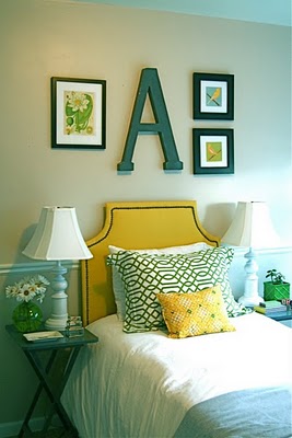
Then, earlier this afternoon, while the children were seriously engrossed in pretending to be Hannah Kearney, Julia Mancuso, and a handful of other winter Olympians, I putzed around on Etsy. I know I said I wasn't really a navy girl. You'll have to forgive me. That was before I found these. Maybe just one.
And to really get a serious pop of pattern and color, two of these one in each corner, with the navy fretwork pillow from above set in front of the left one :) I didn't realize I liked dragons so much, but this Schumacher fabric is super, super fun in very small doses. Like two pillows. These 3 pillows seem very happy to me.
Then, if I were really feeling spunky and if, say, it were the dead of winter and I really needed a boost. I might be coerced into using these on the windows (but without the tiebacks).

With white walls, I might be able to handle the orange :) They seem a little scary, but worth trying out. They're only curtains after all, and one of the best things about a neutral space is how much room you have for experimentation.
These green ones would be a little safer. Blue and green are possibly a tad too preppy and expected, though. I do think they would look wonderful with crisp, white walls and a mostly neutral room. Polo, anyone?
 They both seem pretty dramatic for everyday, all year. I'd probably stick with the white window treatments most of the time. The colorful curtains are very fun, and I might like them for a little while (especially at those awesome IKEA prices), but I'd be far more likely to stick with the white window treatments and just add some apricot-colored flowers and some green McCoy vases, instead. Or, OR, I could just try to really keep the accents extra traditional and classic, like with blue and white transferware, and - who knows - maybe the orange would work.
So, put all together, our neutral living room would wind up something like this...

Hmmm... that's actually not all too much boldness is it? I kind of like the complimentary color scheme when it's on this neutral background. I like the multiple shades of blue and the flowers being a slightly lighter tone of apricot/orange than the curtains. It looks kind of Suzanne Kasler on a much less Kasler-y scale.
Interesting.
Or it would look like this...


The blogs I'm removing (but, sometimes, still reading because I feel some strange emotional attachment to a couple, in particular - I *like* these bloggers!) are really wonderful blogs. I mean really wonderful. But they are muddling my thinking in one way or another. My first edit has been so profitable that I really think the next step is a necessary one.
If you're still trying to figure out your own personal (truly personal!) style, I'd recommend first spending plenty of time looking, looking, looking at lots of rooms from lots of sources. That step was critical for us. But, then, when you start to get a solid idea of where you are and are not heading with your designs, consider editing your influences - for a time - to help get a clearer direction.
That's where we are at this point. So, every design blog that's listed in our sidebar right now is there because I think it's helpful in further defining our style. Some are not design blogs, but are just blogs that I enjoy and that have something to do with making our home. Some are up there "on trial" - I'm checking them out for a bit to see if they're helpful. If you think you might have a personal style similar to our own in some ways, I encourage you to check them out. You might find a new one that you really like :)

It's from the home of Sarah Hartill, editor of Canadian House & Home (which is fast becoming one of my favorite shelter publications). I love nearly everything about this room. It's just relaxed enough, yet just put together enough. It's punchy but still serene. Orderly, but not in a hyper-managed way. It's a fanstastic example of how a room can begin solely neutral, but still wind up with plenty of color. And that rug makes me smile every time I see it.
The room still looks good with a different rug, too, though :) I thought it was interesting to find two images of this room, differing only in the floor covering.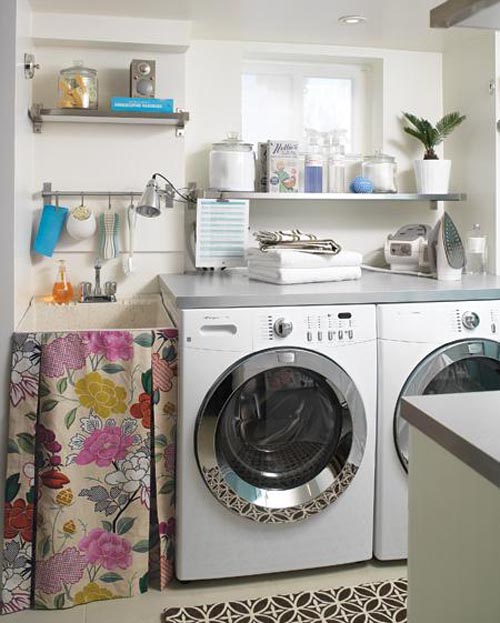
Something about all of the pattern Hartill used, maybe. Or the cheery colors. Or both. I wonder if she knew ahead of time that the washer and dryer were going to reflect the rug like that. Almost like a mirror. I suspect that was a happy accident.
Here's another view of the room with the striped rug - which is my preference between the two choices.
It's pretty safe to say that I'm sold on a bold rug for the laundry room now. And I believe I must have pegboard.
Now, back to the brown graphic rug one more time...

It's funny, I posted the image above (from Apartment Therapy) back in April, when I first started thinking about adding a desk in the laundry room. I hadn't seen the rest of the room at that point. When I stumbled upon the photos that show the sink area, I didn't realize at first that the opposite side of the room was the room I'd already locked away in my little brain. The rug tipped me off, though, and once I realized they were photos of the same room, I was giddy.
A few things to notice:
Hartill painted the far wall in light blue as an accent wall to balance the blue of the map across from it. It seems from the photos that the painted wall is a shade or two lighter than the map, but definitely taking a cue from it's color.
That same blue only appears a few other times in the room, and in seemingly insignificant ways. But, because so much of the room is white, stainless, or otherwise neutral, those blues really pop out.
There is no earthly reason why that sink fabric would work with the blue - or a map, for that matter. But it all works so beautifully. More so, I think, than it would have had Hartill chosen a color from the floral for the accent wall or had she chosen a vintagey map with the creams, taupes, and roses found in the fabric. The mismatch is the key to this room's personality.
The rugs, both of them, are strong both in pattern and color and are immediately a grounding focal point to a rather full, small room.
I think one of the biggest things to note from this room is Hartill's restraint. Had the ironing board cover been patterned or brightly colored, or had she used the reds or pinks or golds instead of white, glass, and stainless for the many containers and bins, the room would've had a much busier feel. All of the white, glass, and stainless really work to set the stage to let the sink fabric, map, rug, and accent wall star. There isn't too much visual competition.
Let me just take a minute here to beat this into my head.
Restraint.
REstraint.
ReSTRAINT.
Gotta remember that.
I love this room.
Love it.


