Showing posts with label interior colors. Show all posts

Friday, April 13, 2012

How Much Color?


Happy Friday, everybody!

I guess I'm going through another stage of tweaking my personal style. I've had our little sidebar on the brain lately. That handy dandy bulleted list has been really helpful since I first put it up. When I start to be overly influenced by any one style (hello, happy Swedes!), it brings me back, grounds me, and reminds me what's right for this house - for us - and what isn't.

via apartment therapy


Just so you don't have to scroll down to see what I'm talking about, here's the sidebar list:

1) firmly rooted in tradition
2) but with an element of unexpected FUN to keep it from becoming too stuffy or formulaic
3) a balance of masculine and feminine... not too much of either
4) welcoming - with comfortable seating & a variety of textures
5) personal - with details from the heart
6) a little sophisticated - with antiques & vintage touches like silverplate, transferware, treenware, milkglass, etc.
7) classic - avoiding the latest trends
8) all about the light
9) plenty of WHITE with high-contrast neutrals
10) architectural elements (which is why this first layer really matters!)


From the get-go, we've been working on number 9. The trim has been a huge factor in adding the much needed bright white to our home. Plus, the curtains - as you know - are all crisp white and now we have the white furniture in the family room. The high contrast neutrals usually come in the form of dark wood (which is receiving its fair share of flack from haters these days, but I still love walnut, cherry, and mahogany tones) and the black doors. We still have a ways to go, but a pattern is beginning to emerge. A continuity.

But, despite my love of whites, grays, and greiges, I've always wanted the high contrast neutrals to be punctuated with color. Because I love color. But, it's been a slow process. SO much of what worked in our previous house just hasn't worked here. It's like starting from scratch in a number of respects. The color is just now coming around.

via apartment therapy


And it has me thinking. How much color do I want our rooms to have? With all the white and neutrals as a clean slate of sorts, I think a few of the rooms could handle some pretty serious doses of color at this point. But do I want that? I'm not a minimalist, but I like an overall feeling of order... nothing too visually jarring. (You know... like my kids' bedroom.) I like rooms that are edited enough to make them low-stress, but not so edited that they don't seem genuine or comfortable anymore. All that holds true with color, too. I like enough, but not too much.

via apartment therapy


I'm trying to figure out exactly what that means right now. It's likely to be one of those ever-evolving components of making this house our home... how much color is right seems like it will change with different seasons and stages. It's a question that will even have a different answer from room to room. When we first moved in and everything was disorganized and BROWN, all I wanted was serenity. A peaceful, relaxed, ordered, welcoming feeling. And white, white, white, please white!

Now we're so much closer to that, and I find myself wanting big doses of happy color... like a celebration.

Because today is a gift.

Corny?

Whatevs.

Blame it on the baby. I don't want to make it sound like having a baby is all fun and games... like it isn't hard at times. I don't want to make anyone feel guilty for feeling differently or think something is wrong with them if they aren't all about lots of children. But, I feel most like myself with a baby in the house. I'm calmer, sweeter, kinder, and generally more aware of everyday blessings with a babe in arms. Life IS a celebration in a lot of ways. There is so much to be thankful for. So, this is a stage where I could see myself really going nuts and making the house like a box of crayolas. I want to play with our rooms, get creative, experiment some, and not be afraid to try something new. Because I'm happy! I'm blessed! And because it's FUN.

via IKEA family live


But, I'd like to balance this laid-back playful aspect with what I know to also be tried and true preferences for our home. I don't want to wind up 3 years from now with a bunch of stuff I don't even like anymore. I am trying to analyze my/our style to help me make wise, lasting decisions.

So, I'm just not sure right now. I'm looking at all the photos in this post and thinking. I'm looking at the gorgeous pink alstromeria on the table across the room, the yellow tulips beside me, the green pillows to my right, and the rainbow blanket on my lap (yes, I bought a rainbow blanket) and I'm just thinking. But, I suspect the answer to my question is only going to be found by actually doing.


I'm so safe. So neutral. Maybe it's okay to think less with some things, and just have fun. I'm gun shy from wasting money in the past, but I've put a lot of effort into defining my style... maybe the risks are inherently safer now because of that?


I'm so deep. Ha.

Whatever. Bottom line? I like my new blankie. And I'm in the mood for more color. I'll just add a little here and there until it's just right. Funny it took me a whole post to get to that last sentence. Thanks for helping me think that out, blog.

What about you guys? Do you have super colorful houses? Do you have sort of low-commital ways that you play around with color?


Wednesday, February 29, 2012

dear, sweet color wheel (nerdy post)


You should know I've been studying, again. And I get nerdy with my posts when I've been studying. This is about to put over half of you (silent goobers) to sleep before the second paragraph. So, maybe you should just skip it if the words "color" and "theory" spoken together make you want to head for the hills. I'll have pictures of the baby tomorrow for you instead.

Consider yourself advised.

I've been thinking about color... again. Specifically, the glorious color wheel. More specifically, about whether or not I'm still an analogous color girl. Analogous colors are the colors right beside one another on the color wheel. Depending on how detailed the color wheel is, they're color combinations like blue paired with green or like red paired with orange.


Analogous colors are besties named Ana and Gus. They're always side by side. There, now you'll always remember what analogous colors are if you didn't already know! Well, I've always liked analogous color schemes... especially in muted tones of the colors. A tone is any color/hue of the spectrum with gray added. I (nearly) always choose paint colors from the grays or neutrals. That's where you go to get subtle blues, greens, purples, anything.


Isn't that beautiful?

That smallest inner ring would be my go-to for wall color - except for white, of course. So, see? Not pure colors. Slate instead of blue. My favorite colors are kind of nondescript. Is that gray or green or blue? The best answer is, yes!

apartment therapy


But, as I've been thinking more lately, this whole subtle-analogous-tones-of-color thing really only pertains to the color foundations of a room for me. The walls... the floors... the window treatments... the major furnishings. I like those things to be fairly neutral and fairly analogous... usually. (Wood floors would be an exception, but then rugs bring the floor color back into play). I like them to be shades or tones instead of purer hues...usually. And in this house I like them to be light in value. Very light in value. Value is how dark or light a color appears due to how much light it reflects. That inner ring is high in value. Pale pink is high in value... deep red is low in value. Like the colors on a paint strip... the ones at the top are higher value and the ones at the bottom are lower. There isn't a lot of natural light going on in most of our rooms (roof overhang... didn't count on that one), so we have to make up for it with higher value walls. Low value/dark colors would... and did... make it feel like a CAVE.

Lonny mag


I'm all settled on everything color-wise up to this point. But, then we get to accent colors and I'm still learning about myself. I used to think I liked the accent colors to be fairly analogous, too, like the foundations. If the walls were blue gray, for instance, I liked the accent colors to be within some part of the blue range. Or maybe one hue over on the wheel... green. But, definitely not waaaaaaaay over on the opposite side of the wheel. Like - orange! Eeek.

I don't have those same opinions anymore. It may be a phase, but right now the very FIRST accent color I'd want to put in a blue gray room would be orange. Just a little bit. Colors across from one another on the color wheel are complimentary. Beside one another = analogous and across from one another = complimentary. In general, analogous colors are soothing and low energy while complimentary colors are stimulating and high energy. I get a lot of visual stimuli in the course of an average day (5 children and all their happy stuff), so I still lean toward less is more in our most frequently used rooms. However, when winter days go on and on, I'm all about the color... all about a little complimentary action on that wheel.

(quick side note for the really nerdy: the complimentary pops of color in most of these photos follow the pattern of across and then over one. Nicole Balch, for instance, likes to put pops of yellow with pink. Pink, which is a tint of red (white added), has green as it's complimentary color directly across from it. One hue over from that is yellow. Across and over one is a pretty common trend right now for color accents. It's the "slightly off" look that Domino inspired. It's "off" because it just slighty left or right of the true complimentary color. I just figured this out! Nifty, eh?)


This is why I'm hoping to rely mainly on easily changed items to provide the accent colors. I want to play round with the color. Make changes without breaking the bank and without taking lots of time. I want to fiddle with color and keep learning about it... how it works and what I like. But, what I like changes so often - see the cyclical nature of all this?

apartment therapy


All the photos in this post are rooms that, for one reason or another, I'm really drawn to right now. All of them use color well and in a way I feel like I could live with and easily change up. I'm learning from these rooms and thinking through our own. One of the things I'm trying to focus on right now is learning how much color I'm after. For me, color is not a case of 'more is better'. I like it to have simple impact. No Miles Redd. How much is too much for me? How much is not enough and just too bo-ring?

Just some rambly color theory thoughts for your Wednesday.

Have a great day and happy Leap Year! (Wouldn't it be CRAZY if my sister's baby came today?!)


p.s. great summary of all the junk i said about hue, tint, shade, and tone :)

Monday, June 14, 2010

Bedroom 2 Paint Color and Progress


I was reading tonight about Jenny's design process at Little Green Notebook. It's always so interesting to me to read how designers/decorators go about a project. Jenny always begins a room with a fabric choice. Her reasoning is that there are a blue zillion paint colors available - not to mention the ability to color match anything you can dream up - but there are only so many fabrics available. You can always find a paint color that will work, but finding fabric that works with a pre-existing wall color can be much trickier. Plus, fabric is her love and a pretty print instantly inspires her.

All of that makes complete sense.

Unless, like me, your primary goal with paint colors is to choose neutrals that pretty much go with any other color imaginable. Because you also really love fabric and because you know you're going to be switching out colors.

A lot.

Eventually.

You know, once you get this first layer thing checked off your list.


It should come as no surprise then that the wall color for bedroom 2 is another neutral. Honestly, when I swatched the color in bedroom 4 (I originally bought this paint for that room) it had a definite green undertone. Green shows up no where in this paint in bedroom 2. Proving, once again, that lighting is everything when evaluating paint colors.


Regardless, I really like the color in the room. It's very light, hardly noticeable in places. I'm glad, though, because this room is the brightest in the house and I didn't want to lose any of that. I just wanted a teeny bit of color. The big change is that it takes the room from a warm neutral to a cool neutral.


The color is Laura Ashley "Stone 2". Very soft. Very subtle. Totally ready for any fabric and color I want to bring its way.

Eventually.


We're getting there, though. I finished the second coat on the main door this afternoon, and we're very close to wrapping things up. Sam's mom, Susan, is coming on Thursday and I plan on having that room ready to use by then. One glitch that took far more time than we bargained for was the drywall mudding Sam needed to do around the window. When we had that window enlarged, the plan was for Sam to deal with the corners after the first bit of mud dried. It didn't look like that big of a deal.


But, we soon learned that outside corners like that are harder to do than they seem. Getting a straight, smooth edge was a challenge.


After several mudding sessions, though, look what a nice edge Sam was able to get :)


So, as of today, the walls are all done, the outlets are switched out, new outlet plates are up, closet shelves and the new, wooden closet rod are all drying and waiting to go back in, the main door is drying, and we're very, very close to finished.

That means that the next post on this room will be the official first layer "after" post :)


Wednesday, May 19, 2010

Michelle Adams Etched In My Psyche?


A few weeks back, after we finished up the first layer in Bedroom 3, I was brainstorming about how to work a boy/girl bedroom with a bluish gray backdrop. I came up with a combo of lots of white with red and black accents, incorporating bits of many other colors. You can see the inspiration images that sort of brought this plan about here, but the main "ah ha!" moment came with this gorgeous room from Domino Magazine...


I've saved quite a few images onto my trusty ol' puter within the last year and a half. Many of them I haven't looked at for a while. This afternoon, as I was trying to come up with something for a friend who is choosing paint colors, I stumbled across another Domino image that I was really, really drawn toward. Pretty much everyone on blogosphere was drawn toward it, too, so it's nothing new to anyone. But it did make me wonder something...


I tend to have a pretty good visual memory, and I'm wondering if maybe I had the colors of this room sort of subconsciously hanging out in my mind, just waiting for a chance to come back out and be useful somewhere. Like Punkin and Little Dude's bedroom, for instance.


I definitely think it's possible. I also think it's totally weird that I've kept thinking about a dose of chevron stripes in that room, too. Coincidence? Hmm? Now that I think of it, I was just googling chevron fabric a few weeks back and actually looked at this very Rubie Green fabric (Adams is the mastermind behind Rubie Green).


So, I suppose I have Michelle Adams' apartment etched into my psyche or something. Strange, huh?

Really, though, there are worse things.


Thursday, May 6, 2010

Green


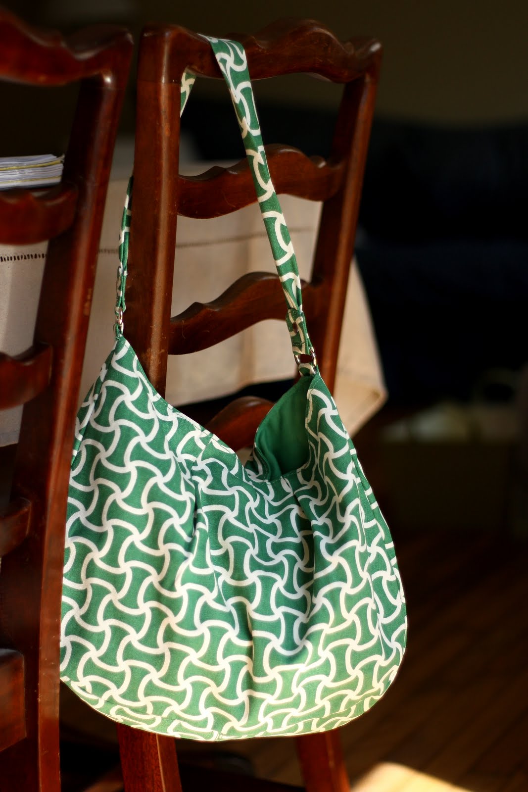
I'm kind of obsessed with green right now. It's not the most flattering color with my hair and skin tone (unless it's juuust right), so I have to use it creatively. Target had yet to put out flats in a really great green this year, but they totally came through in the bag department. I picked this little gal up for just 10 beans.


I may not be accessorizing my house, yet, but I can still accessorize ME!


And my children.


Shug picked out that t-shirt a few weeks ago, and she loves it so. It's nice, and very her. Sunny. My green is bluer. More like my purse. With our dark hair and hazel eyes, my best green is more like SweetP's green...


My favorite color with green right now is gray.


Those two colors are just a fabulous combination. If I were in the accessorizing stage right now, you'd be seeing some green and white striped pillows on my gray sofa.

I'm not sure, but I think this is where the whole thing really began (second photo down). Makes me wonder if maybe I can work some green into Bedroom 3 somehow.

What about you guys? Does green say spring for you, too? What accent color has you smitten these days?


Wednesday, September 16, 2009

Colorcharts.org


How cool is this website? Colorcharts. org!

You can browse around for forever if you're a color junkie like me, or you can search a specific paint name and oila! There it is. It gets really fun (and addictive), though, when you select the color you're searching for and then click on the "match this" button directly below the color square. The site gives you the names and brands of lots of different colors that match your choice! It's just good, clean fun :)

Enjoy!

Monday, August 10, 2009

Take Six

I'm up to six paint tries in SweetP's room now. I know, I know.


I know.

In case you're wondering how someone gets the color wrong at least six times, let me assure you that it's really not at all difficult. In fact, it's especially easy when you're a visual person who has a definite idea in her head, and you're just trying to figure out how to get it from your head to your wall. Make sense? I wanted a subtle, light, tan/beige. Not too yellowy gold, not too gray. Well, here's how I got to this point.

First, I tried Nicole Balch's nursery color - Behr "Wheat Bread". Lovely color - actually, very similar to our kitchen color. Loved it in Nicole's pictures. Too dark and too gray for what I was after, though. Perfect for Elenor, not perfect for SweetP.

Next, I tried a paint I already had - Sherwin Williams "Aesthetic White". It was one of the rejected options for the foyer - and it was rejected here, too. Super pale gray blue. Bummer.

After that, I gave Benjamin Moore's "Berber White" a try (also known as Manchester Tan). I had read lovely things about this color in House Beautiful. Swatched it up. And? Not at all tan in this room nor a white. Downright green, really. Granted, it was a really pretty pale gray green. But I didn't want green. Not the one.

What does that bring us up to? 3?

I think next I went over to Lowe's and grabbed a color that I thought looked about right, but maybe too dark. Laura Ashley "Stone 2". Since it looked a little dark for my purposes, I had them mix it at 50%. (I had actually asked for 75%, but the gal behind the counter convinced me to go lighter). Guess what?

Wrong. Way too light.

So, next I went back to Lowe's and got a can of Stone 2 as is. I was thinking this looked pretty promising. It was very pretty color on the wall - not too dark at all as I had originally thought - but it was grayer than I had been envisioning. Still - very nice color. Definite possibility.


But, I wanted to try just one more. So, Friday, when I was near the only local store that sells Benjamin Moore paints, I picked up a can of Carrington Beige to test in SweetP's bedroom and two whites for the foyer (per Erika at Urban Grace Interiors). It was totally green on my walls. There's a large tree in the yard in front of SweetP's bedroom window. All of the natural light in the room is filtered through its leaves. I have no idea how Carrington Beige might have looked had it been winter, but I know that in August in SweetP's room - Carrington Beige is green. Lighting is everything, remember?


So, tomorrow I'm going to try just one more color.

Ha - not really. I'm done. I think six is my limit. Laura Ashley "Stone 2" is the chosen color. It's not what I had in my mind's eye, but enough is enough already.


Besides, it's really a lovely color :)

Thursday, August 6, 2009

Our Special Order Doors Are In!!!


Hot dog! The new doors are here!!!


Hoping to get them painted and hung within the week. Yes, in the picture below, the doors seem too large for the space. That's because they are. We had to custom order the doors ($) because they are sooooo short here (there's a vent that runs across the ceiling there - making the door opening extremely short). This is the smallest we could get them! Sam will have to take an additional 2" off. It's the best we can do with this weird ceiling height. There are no holes for knobs, either, because Home Depot recommended placing them after resizing the doors. Makes sense.


First, though, I have to choose a paint color... I tested SW's "Aesthetic White" on the entryway walls and "Accessible Beige" on the doors and trim. Aesthetic White turned out to be more like Aesthetic Pale Blue, so that's a no go. Accessible Beige is a definite possibility for the doors and trim throughout the entryway and family room - if the walls are whiter. Of course, this does not include the doors that will be black.


I'll be testing BMoore's "Carrington Beige" for the trim/door color next week, and also BM's "White Dove" and "Decorator's White" for the entry and family room walls.


Then, I can paint the new doors and finish up those entryway doors that I've been testing on. Hoorah for covered water heaters and furnaces :)


P.S. At risk of being really pitiful - I see you people lurking and not commenting. After yesterday's post, there were 12 people on here at one time, and no comments! C'mon, now. Make a girl's day and say something nice :)


Wednesday, August 5, 2009

Choosing Paint Colors

Among other ways, this is how I know that Sam really loves me.


A lot.

It always takes me several tries before I get a color just right for a room. And I need to paint the swatches on the walls. BIG swatches, on ALL of the walls. How can I possibly know if the color is right otherwise? ;) He's very patient with me.

Actually, swatching was forbidden in our family for a little while due to the 15 months (I'm not joking) that I had yellow swatches on the family room walls of our previous house. There was just no picking that yellow! Eventually, we realized that Sam had put energy-saving but yucky-light-warmth florescent blubs in the recessed fixtures. Aha! Not my fault at all! Any yellow I was going to choose was going to wind up sallow and slightly green at night because of those bulbs.

#1 Thing to Remember When Choosing Paint: Lighting is Everything.

So, I agreed that the swatching experience had been less than desirable that time (although, not my fault really), and I understood his negativity toward the whole now distasteful practice when I began choosing paint colors for the new house.


For the first few colors, I painted sheets of card stockish paper from Sherwin Williams. That was an okay process, but with rooms that have constantly changing light, it's a little tricky to keep holding the cards up on each different wall and at many different times throughout the day. The kitchen color and the exterior colors went fairly well with that method, but Shug and Punkin's room was a little "off". When it came time to choose a color for SweetP's room - I mean since I was going to be painting it very, very soon and everything - surely swatching this room would be okay. Right?

It actually took him a few days to notice. He looked at the wall and calmly asked, "Why are there swatches on my wall?". He loves me, I tell you :)

So far, I've tested around 4 colors in SweetP's room. One of them is really pretty, but isn't what I had been envisioning. It never ceases to amaze me how one paint can look completely different in two different rooms. That's why the #1 Rule up there in big, bold red is so important. And it's also why I test colors before I buy anything larger that a test pint. Think about it - what is color anyway? It's the light spectrum reflecting off of objects. When the light reflecting off of any paint changes, the color changes! There's no way to know how a color will behave in any given room without testing it out. Generously. I'm going to try one more color in this room after the weekend - Carrington Beige by Benjamin Moore. Hopefully, it'll be a go :)


By the way, the cardstock sheets from Sherwin Williams are not simply cardstock material. They are specially made so the corners do not curl up when wet and so the thick paper does not wrinkle up at all. It's important that the sheets stay completely flat in order to get a true read of the color against the wall. Any curling or bumps would affect the shadows/light and - theoretically, at least - affect the color. They aren't pricey, and they're very sturdy. I think around $3 per sheet. If you cannot swatch - that's the next best thing :)